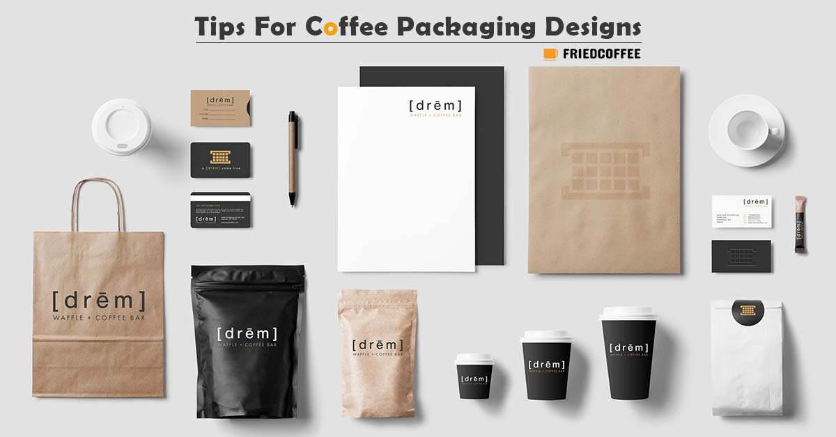
Beautiful packaging for your coffee products is considered artwork. But, not all brands succeed with their packaging. With the incredible variety of coffee packaging, you can easily determine a good and bad packaging design through a walk in your local supermarket.
Your packaging can either make or break your brand. This makes it essential to generate a good first impression, especially for growing companies. Good packaging can help their brand noticeably in the competitive market. Have a look at the top-selling coffee beans and you will know that they have something to play with packaging as well.
So to help coffee packagers start, we have compiled six tips in creating an eye-catching packaging design for your coffee products in this article.
#1 Consider the Tone of Your Brand

Keep your brand’s tone in mind in the design process of your packaging. The styles, colors, and designs you use in your coffee packaging help convey a message regarding your company. Your goal is to keep the message consistent with the story of your brand. Moreover, the tone of your brand should influence the majority of the decisions you do in your packaging. This starts with your choices of color for your finishing materials.
#2 Feature Your Coffee Brand
The brand of a company includes cultural, visual, emotional, and rational images along with the experiences consumers identify with the company’s product. Consumers quickly associate specific colors, slogans, and images with certain brands.
So, as you develop your company, it is important that you incorporate your brand when creating packaging. But make sure to keep the consistency of the design of your brand and its location on your coffee products. Consistency can help in developing consumer awareness to help in recognizing your company’s different products once on the shelves.
#3 Emphasize Color
The eyes of a human are drawn to colors. So for you to create a coffee packaging that will stand out, emphasize colors in your designs. Employ color psychology in building a catchy label. Green is mostly associated with nature and health. Meanwhile, gold conveys regal and elegant elements. You can combine different colors in your vibrant design to imitate a certain tone like that of tropical rainforests.
But, you don’t need to incorporate vivid colors when creating packaging for your product to make an eye-catching one. Sometimes, minimalism in your design can also produce a stunning tone just like vibrant labels. Minimalist coffee designs convey the chic and modern aura of your brand. One great example is the Death Wish Coffee brand which has grown significantly and has correctly leveraged the color factor.
#4 Show Off
Does your business have any special awards or certifications? You can show these off when creating your packaging. Consumers who are environmentally aware will search for certifications like USDA Organic or Fair Trade USA on your packaging. But, make sure that your products are properly certified before showing your certifications off on your coffee packaging.
But, if your products do not have any awards or certifications, no worries because this will not prevent you from showing off. Just highlight the values of your brand such as the transparency in your supply chain.
#5 Use Motion
You can create appealing and unique packaging by using moving graphics. Brands in the food and beverage industry that have labels using images that feature motion and action perform better compared to those that use still graphics. This is because consumers have the tendency to see “moving” labels as more exciting compared to others. Thus, there is a higher probability that they will choose these kinds of packaging on store shelves.
Are you planning to include a photograph or illustration on your coffee packaging? You can try a picture of coffee beans spilling from cupped hands or your coffee pouring into a mug. This creates a visual experience for your viewers. Thus, drawing more consumers to your brand and increasing more sales.
#6 Add Graphics
You can quickly grab your consumer’s attention through beautiful and creative art in your packaging. During the design of your coffee packaging, pay attention to the illustrations and graphics you use. The appropriate graphics can either lead to the failure or success of the packaging design you will create.
Consumers will ignore poorly designed and awkward-looking labels because they are attracted more to appealing products. Graphics can help you communicate your brand to your consumers by generating emotional responses.
Conclusion
Consumers often buy coffee products without the help of experienced coffee producers who will guide them on the various roast profiles and flavors. So, you need to make sure that the packaging of your coffee speaks for itself. Incorporate in your label all the things your consumer needs to know about your product and brand’s values.
The right coffee packaging is important in building a growing coffee brand. Also, when you start the design of your labels and logos, it is important that you start with something original. It should embody your brand’s spirit.
By the way, if you are looking for an ideal coffee packaging machine for your product, try LPE’s can filling machines. Because a good design always starts with reliable product packaging.


